Note: This article can be seen as the continuation of a previous article of mine entitled Please guys, pay attention to detail!. In this article I explained why details matter and how graphic resources must be created meticulously as they reflect your product in the outside world. Once again I used the same Google product, the Galaxy Nexus, because I’m quite familiar to it - in other words this is the device I have in my pocket. As a consequence, I’d like to start with the exact same disclaimer: this article is not specifically targeted to Google nor the Galaxy Nexus. It obviously has to be read in a more global manner. I’m sure a booster shot won’t hurt anybody!
Let’s start this article with a quote I love from John Wooden, a former basketball player and coach. Reading the following lines, you will easily notice this quote perfectly fits this article’s subject:
It's the little details that are vital.
Little things make big things happen.
Last week, I spent three amazing days at the Moscone Center in San Francisco, CA for the Google IO. Let’s be honest, this conference is clearly one of the best I have participated in so far. I saw insanely great sessions about various subjects and met very interesting people from Google or other well-known international companies. This year, Google IO focused on mobile and especially Android. As a result, keynotes and sessions was using a lot of images from mobile devices. Unfortunately, as a perfectionist, I was pretty disappointed about some of the graphics. Indeed, a lot of them were untidy, non professional, draft-looking, etc. The worst examples of this happened during the Google+ keynote. It featured some screenshots in which the screen glare was only visible on the device and not on the screenshot itself. I also saw an iPhone in which the screenshot of the application had been applied directly on top of the launcher app. This resulted in a translucent status bar with the background of the launcher which is obviously impossible in real life.
I recently decided to visit the new Nexus website and discovered some similar issues that could have been easily solved. Here are some of them:
- The time displayed on screen is different from the one in the status bar. I guess this is because the designer reused graphics from the ICS release and only changed the status bar. Unfortunately, this huge mistake transforms Android to a crappy platform that can’t even display the current time correctly
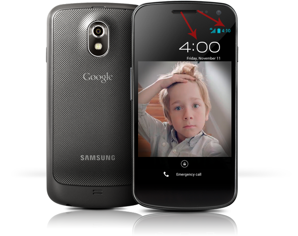
- The disrupted/missing screen glare is probably one of the biggest mistakes I am used to seeing out there. Compared to the previous picture, this screenshot is far from looking professional. It gives the impression the screenshot has been glued to the device frame. There’s is also a more-difficult-to-notice issue on the status bar as it is smaller than it should. I seriously believe the designer used a screenshot from a Nexus 7 tablet and applied it to the Galaxy Nexus thinking nobody would notice the difference between 800x1280 and 720x1280.
- Blurry screenshots waste your product. Be careful when resizing an image and ensure the resize algorithm you use makes the final graphics crisp and sharp. Moreover, the background they used indicate a Jelly Bean release while the displayed time is at 4:00 (ICS). Try to remain logical: if you decided to change the displayed time then follow your own rules and stick to them.
Lots of people think of me as a mobile developer but I am also a huge fan of pixel perfect graphics and applications. As a result I spend at least 15% of my time working on software like Photoshop or Illustrator. I am strongly convinced being a developer doesn’t mean you can’t like great things. As a developer you are not supposed to do your designer’s work but should be multi-skilled enough to handle situations where some design tasks are required. For example, it may be quite handy sometimes to know how to create resources to create a Button or style the background of your ActionBar.
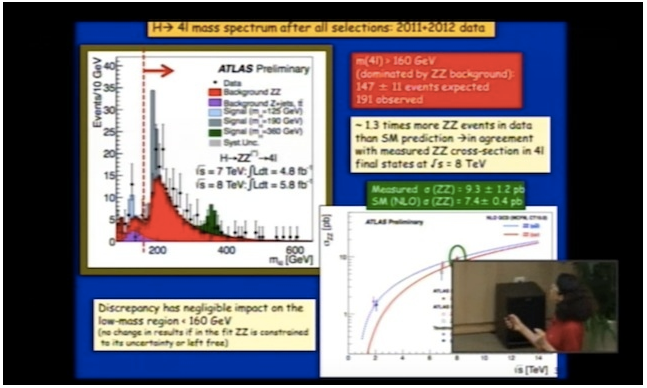
Taking care of the resources you make public is extremely important as it reflects you and your product. When managing a product you always have to have a fine-grained control over the information you release. Screenshots are particularly important as they can carry tons of information. As a developer, you can think of releasing graphic resources as releasing a new API: everything that has been made public is visible and usable by everybody. You will have no opportunity to change it in the future without breaking what has been built on top. Moreover, using inappropriate graphic resources may completely make your product presentation pointless. One of the best recent example I have in mind is the announcement of the existence of the Higgs boson. The CERN team decided to use the Comic Sans MS font on web-from-the-90s-looking slides (cf The Verge). From my point of view, the poor quality of the presentation (obviously I am not talking about the content of the presentation itself) totally ruined the actual revelation of the announcement. People almost talked more about how crappy the slides were instead of the amazing announcement of the Higgs boson existence:
Here is some advice I gathered to create professional-looking graphic assets:
Always ensure your screenshots are consistent: Just like you love to have a cohesive environment on your desktop, at home or at work, people appreciate consistency in marketing pictures. As a result, taking screenshots with the same version of your app and Android platform in the best guarantee your users won’t be jostled.
Create physically accurate screenshots: When modifying the content of your screenshots always make sure the resulting image is physically “doable”. For instance, if you modify the time in the status bar, make sure the alarm widget is also modified. The other common issue occurs when using a screen glare as I described earlier. The image you show must be something the user can see in the real world.
Apply the exact same status bar on all of your screenshots: Android status bars have changed quite a lot over time. It was grey with black information on Android 1.6, switched to black with green and gray information on Gingerbread and finally switched to black with blue/grey information on Honeycomb. When releasing screenshots always try to reuse the same status bar, preferably the latest version of it.
Have clear and clean status bar icons: You generally don’t want your users to be distracted by a large set of status bar icons. Make them focus on the actual content of your application by removing all un-necessary icons (notification icons, alarm, silent mode, etc.). Also use completely filled up icons for fillable icons: battery, reception, etc.
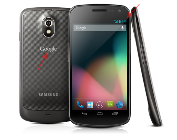
Override the current time: Releasing a graphic indicating a screenshot was taken at 2AM in clearly not professional. It may indicate you rushed to finalize the application. Use a smart and ingenious time and stick to it! For instance Google, with the Galaxy Nexus uses the version of latest platform: 4:00 for Ice Cream Sandwich and 4:10 for Jelly Bean. Apple generally uses 9:41, the time at which products such as the iPhone or the iPad are likely to be introduced.
Always use the same device frame: If you have decided to base your graphics on the latest Google Android devices then stick to it. Using different device frames may make people think they are looking at different apps running on different hardware. It is usually a good idea to increase consistency by associating your app to a single Android device.
Enforce branding if needed: You may add icons to ensure your screenshots are personalized but if you do so, make sure the result is Android compliant. For instance, you may add a notification icon in the status bar. When doing so, always ensure your icons follow the guidelines as described on the Android website.
Use screen glare cleverly: Keep in mind, screen glares are not appropriate on screen-only screenshots. They are usually used in addition to a device frame.
That’s a lot of rules, isn’t it? Fortunately, some tools and resources do exist to help you. Roman Nurik’s Android device frame generator lets you easily create device-framed screenshots with a simple drag and drop gesture. Roman’s generator is awesome. However, the simplicity of this tool makes it also less powerful than Photoshop. Personally I don’t use the Android device frame generator for various reasons: drop shadow too strong - especially on white background, missing device reflection, un-optimized exported PNG, no status bar standardization, etc.
Below are the PSDs I made and use for my own screenshots. These files have been created in Photoshop CS6 but should work properly with all recent versions of CS. Also note the following resources are licensed under the CC BY 3.0:
The PSDs above are very simple to use and will help you to generate graphic resources in a few steps:
- Open the appropriate PSD and the screenshot in Photoshop
- Copy the entire source screenshot (⌘A and ⌘V)
- Open the “Smart Object” (double click) and paste the source image (⌘V)
- Save and close the “Smart Object” (⌘S and ⌘W)
- Export the result for the web using the Photoshop optimizer (⌥⇧⌘S)
I know Photoshop may be quite difficult to apprehend so I made a small demonstration video in which the few steps are explained in details.
Carefully spreading your work on the Internet is extremely important. It shows how great your product is and the amount of attention you gave while designing it. The more care you give to the screenshots, the more you’ll say to your audience you brought care to your application, its features, its design, etc. I’m not a marketing guy but I can say that consumers are very impacted by the way things are presented. Be consistent, look carefully at the details, control what you are spreading in the outside world.