I was recently invited to Ankara, Turkey for the Android Developer Days. I gave a talk entitled “Deep Dive Into Android State Restoration” and spent a wonderful time there. In order to go to the event I obviously spent a lot of time travelling. The travel, in addition to usual transportation issues (cancelled trains, delayed flights, etc.) gave me plenty of time to get bored… For some reasons, I started playing with the Android Clock application and noticed several issues and possible improvements.
This post can be considered as a quick app clinic on the Android Clock app. App clinic is generally dedicated to third-party apps but, after all, there is absolutely no reasons it can’t be performed on Google apps… I also think showing and explaining the few details that could have been better is a great way to learn and improve. Demonstrating a UI/UX guideline using both great and bad examples is how most human interface guidelines are based on. Material Design guidelines use this method a lot. Also keep in mind guidelines and reviews are not definitive rules and are, by definition, subject to discussion.
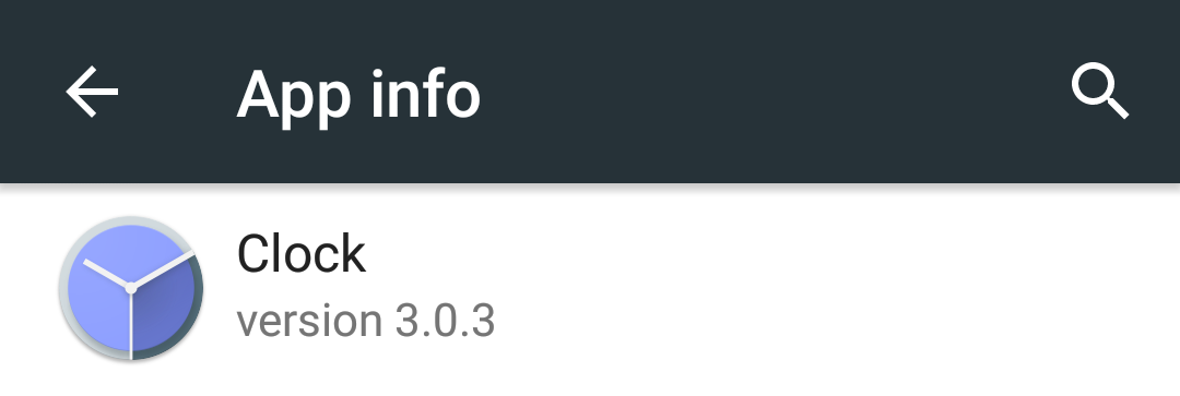
Prior starting with the list of notes I made about the Clock app, I think it is important to point out the reviewed version of the app. The package manager gives 3.0.3. As far as I can tell, this is the latest one currently available.
From a global point of view, the Clock application is clearly a well polished application. It doesn’t crash, runs smooth animations, features a beautiful material design, have some nice unique details (animated icons on tab change, hour-of-day based background color), etc. Most of the notes listed below can actually be considered as little details. But there are no little details. Details make your product. They are part of your design and literally bring your app to life. Understanding and fixing all of these tiny details helps both in making your app more pleasant to use and making it stand out of the other apps on the Google Play Store.
There are no little details. Details make your product. They are part of your design and literally bring your app to life.
Use comfortable touchable area
Interactions with mobile devices are mainly based on touch-screens. Because the touch-screen is the only thing between users' fingers and your application, you need to make sure actions are properly intercepted. Smaller touch targets are harder for users to hit than larger ones. Always make your touchable areas are large enough to be easily tapped.
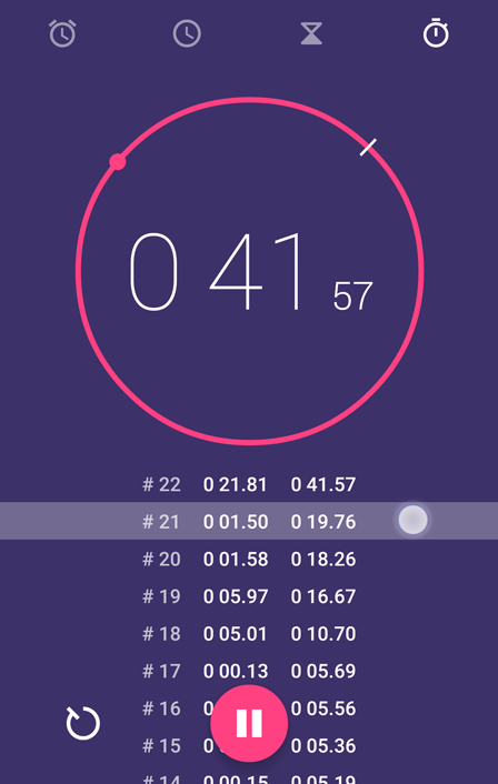
It is generally considered a touch target should be at least 48x48dp. Although these requirements make sense in most situations, it doesn’t mean you can’t make targets larger. Using large touch targets is even encouraged whenever possible. In the “Timer” section of the Clock app, both the “Delete timer” and “Add new timer” buttons clearly lacks of touchable width leading to potentially no-op taps. Enlarging the touchable areas makes buttons more accessible while preserving the current layout and design of the screen.
Large touch targets favor easy and quick interactions.
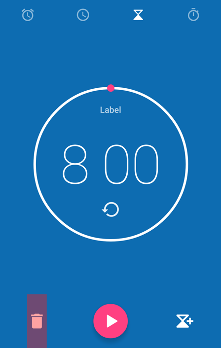
Small sized touchable areas leads to frustrating no-op taps.
Display feedback whenever necessary
Input feedback is an extremely important part of UX design. It basically consists on informing the user his/her input/action/whatever is being tracked and processed by the application. Just like there is a reaction to any force in the real world, there must be a feedback to any action in UIs. When a button is pressed, its appearance changes to reflect the pressed state. When a list is pulled down to be refreshed, a visual indicator appears to notify the loading is in progress. When a tap occurs on the top edge of the screen, the notification tray slides down quickly to indicate its presence.
Just like there is a reaction to any force in the real world, there must be a feedback to any action in UIs.
Quite logically, feedback only make sense when a counterpart action is about to be performed by the application. Reacting to user’s input but doing nothing in response increases frustration and reduces UI comprehension. In other words, a UI should be completely transparent to user’s input if the area is not interactive.
The "expand" button lacks of a comprehensive feedback.
Feedback with no subsequent actions make the UI misleading.
Clearly indicate a screen’s purpose/context with titles
Most mobile application are made of several screens. Screens can be reached thanks to navigation patterns leading to a complex screen hierarchy. This is especially true when the app displays a lot of content. In order not to lose the user when switching from one screen to another, it is important to show the purpose of each screen. This is a key point in UI/UX design that is mainly solved by adding a title to all of your screens. In some cases, using screen titles may also help users better understand the overall navigation pattern of your app.
Preserving the context of each application is both essential and difficult to do on mobile apps. Indeed, mobile screens are generally small and don’t leave a lot of room to add titles. By default, the Toolbar (R.I.P. ActionBar) is the perfect place to put the title. If you want to preserve as much space as possible on screen, do not hesitate to use some smart scrolling techniques to hide the Toolbar when the content is being scrolled (e.g. Google Play Store).
The screen's purpose is clear thanks to its title.
What is this screen? What is its main purpose?
Inform about the current screen state
As described earlier, feedback is obvious when performing a direct interaction with the UI. However, it is clearly not limited to it. Another great feedback you can implement is “state feedback”. Although the expression seems quite abstract it simply consists on informing the user about the current state the app/screen is in. Most common states are: “content”, “loading”, “error” or “empty”.
There are plenty of ways to visually display a state feedback. Empty states are generally displayed where the content would have normally be displayed. Error states may also be displayed in-layout or using widgets such as Toast or snackbars. Finally loading states are generally displayed outside of the content area as it may occur at the same time. Indeed, the loading state is not exclusive to the content state: an app may be both displaying content (from local database) and loading data from the network.
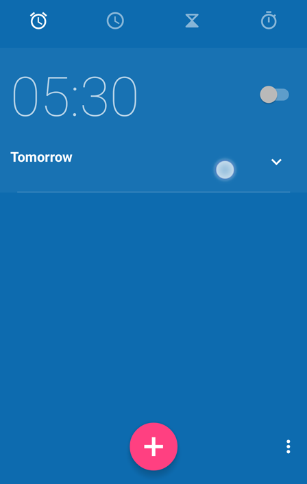
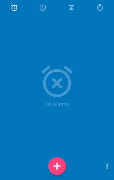
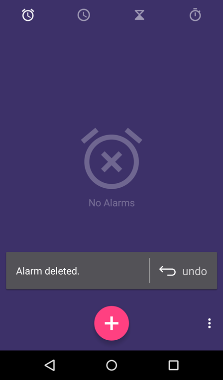
The text and icon clearly suggest no alarms are set.
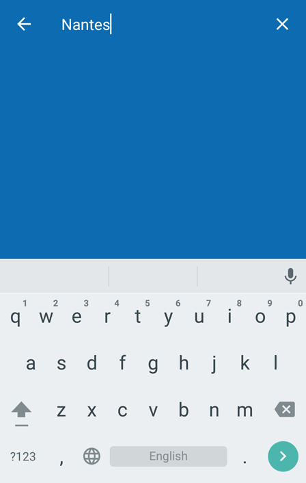
There is no feedback for a simple "Nantes" query.
Embrace the system visual language & navigation patterns
The “app as a platform” vision is often discussed on social network. I’m personally convinced an application should never create its own visual language but rather extend the platform language the app in running on1. The approach mainly consists on using the platform visual language as a starting point and build your brand and style on top of it.
Embracing the platform visual language & navigation patterns […] reduces the cognitive load and enhances the comprehensiveness of the UI.
Embracing the platform visual language & navigation patterns has several advantages. First, it obviously reduces the amount of work third-party apps requires to get nice user interfaces. Secondly, it reduces the cognitive load and enhances the comprehensiveness of the UI. In other words, the user has to make no or low efforts to understand your application because it looks and behaves just like the other ones on the device.
The "undo" icon looks off-topic on Lollipop.
Perform feedback appropriately
We have explained previously how important feedback is. Another important rule to follow when displaying feedback is to make sure it is displayed in a logical way. Basically you have to make sure feedback is done at the correct point in time (i.e. synchronously to the user gesture) and space (i.e. at the location of the interaction). Doing so enforces the impression of responsiveness and accuracy of your app.
The Android Clock application is rather good at displaying a responsive feedback. However, there are some cases where the visual feedback appears at a wrong location. Sometimes it is even doing “over-feedback”.
Feedback is visually bound to the floating action button.
The ripple feedback is not aligned on the tappable icon.
Feedback is done on the entire tappable item.
Over-feedback reduces readability of the user interface.
Preserve consistency between screens
Consistency is an important guideline when it comes to design an application. It obviously makes your code easier to maintain as most snippets are based on the same logic/values/processes/etc. From a UI point of view, consistency is a great way to have a coherent and immersive UI. In fact, consistency reassures users and helps them better deep dive into your application brand and style.
Consistency has a bunch of facets starting from colors, font sizes, font styles, button appearances, etc. There are several techniques to ensure your UI takes the form of a coherent and integrated app. I personally always creates a small set of base values (colors, spacings, grid sizes, font sizes) and create a set of styles (text appearances & widget styles) based on these values. Most designers consider the technique as a painful constraint. I do too … but that is clearly a wanted positive constraint in the long term. After all, mobile is all about creating amazing experiences out of a set of constraints.
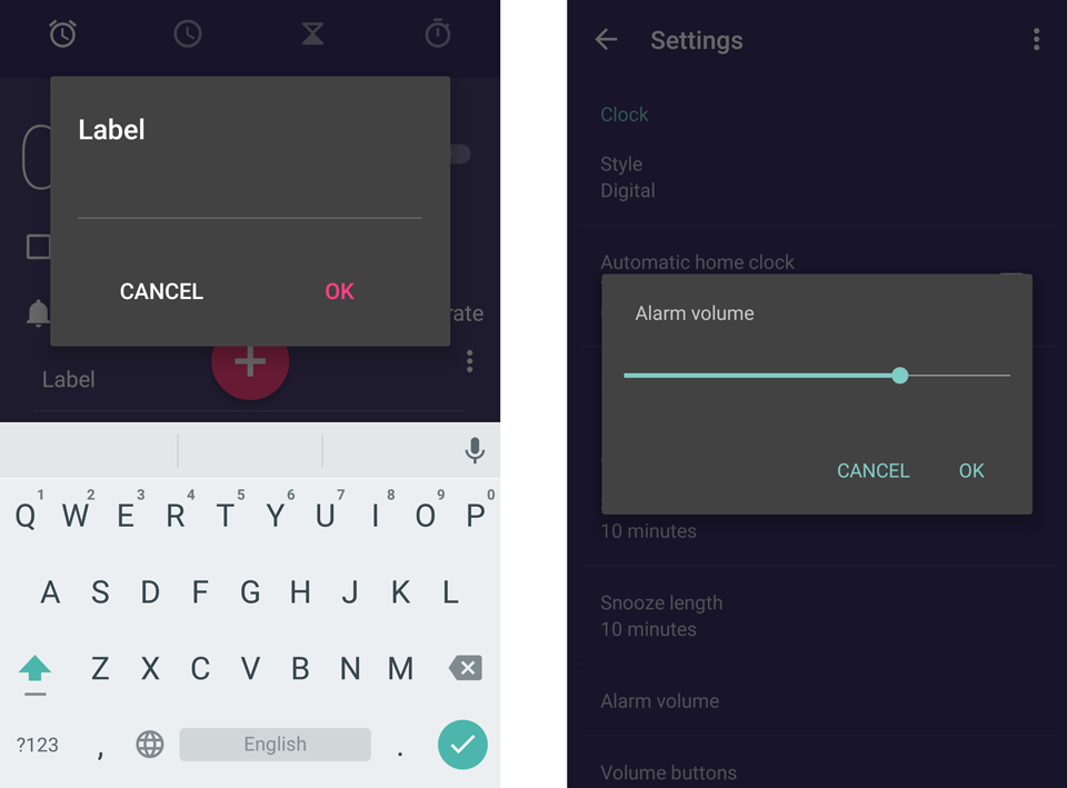
Dialogs style differs throughout the application (both actions and title text appearance, actions layout, etc.).
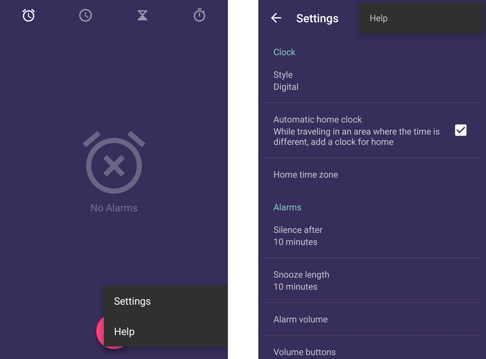
Overflow menus appearances are completely different between the main screen and the settings screen.
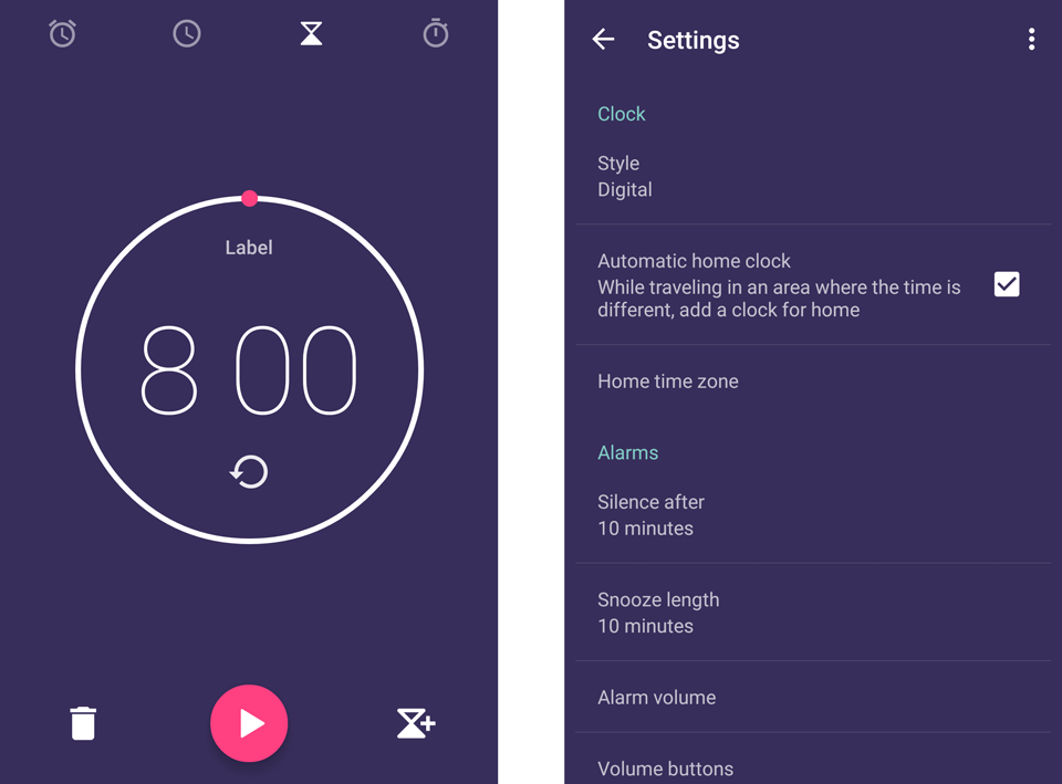
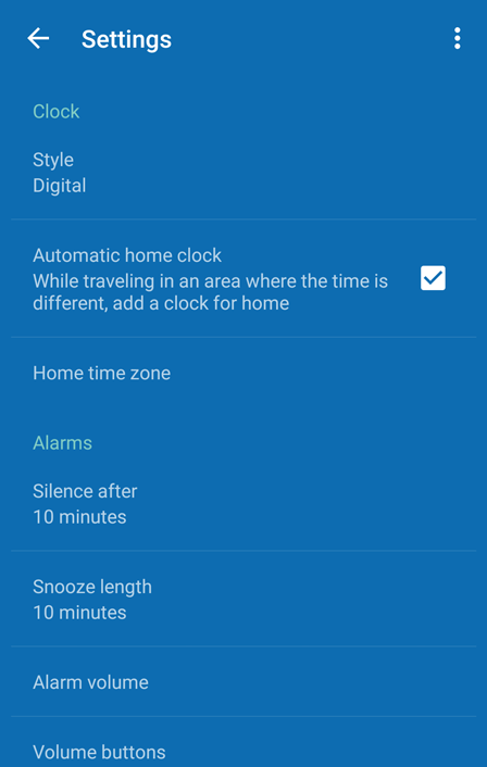
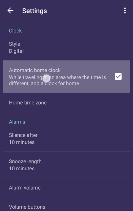
Settings are using a blue accent color while the rest of the app uses a pink color.
Doing an app clinic is an interesting exercise both for the reviewer and the developer. From a reviewer point of view, it is a great way to get to know an application and quickly learn about UI&UX patterns. Because there is no definitive answers to what in wrong or good in UI/UX design, doing app clinics regularly helps better weight the pros and cons of all solutions. From a developer point of view, an app clinic is a great way to take a step back from the mammoth amount of work done on an app. Thanks to external feedbacks, you can better discover what you missed in the code, UI, UX, etc. Obviously, as the maintainer of the app you will always have the final decision on whether or not to tweak and modify your app to reflect reviewers’s notes.
- 1: There are, of course, some cases where having a unique visual language makes sense. These applications are generally extremely immersive. Games are the perfect example of this. Games main purpose is to bring the user to a new world by creating extremely immersive graphic style and removing artefacts that could interfere with the user experience (notifications, status bar, etc.)